This practical requires Python. Go through the page and execute the listed commands in your IDE of choice (you can copy-paste). Don't click on the "answers" links until you have thought hard about the question. Raise your hand should you need any help.
This practical requires the following Python modules:
We will start with the simplest form of GLM, which we can write
mathematically: y=ax+b.
Let's first get some jargon under the belt:
      y   : (vector) measurements, data, dependent variable
      x   : (vector) regressor, design, design matrix independent variable
      a   : (scalar) slope, parameter estimate, regression coefficient
      b   : (scalar) intercept, parameter estimate, regression coefficient
Start by generating simulated data. In Python, generate noisy data y using a
linear model with one regressor x and a given slope and
intercept. (In practice, we would know x and y and would need to fit
the model to get the slope and intercept).
import numpy as np
import scipy
import matplotlib.pylab as plt
import pandas as pd

x = np.arange(1, 20).reshape(-1, 1)
intercept   = -10
slope       = 2.5
y = intercept + slope*x
y = y + 10*np.random.randn(len(y),1) # add some noise
Now plot the data against x:
plt.plot(x,y,'o')
plt.xlabel('x')
plt.ylabel('y')
plt.show()
Now we need to create the 'design matrix', which is the same as writing the GLM in matrix form:
mat = np.concatenate([np.ones_like(x),x],axis=1)
The first column is just a column of ones. The second is the
regressor of interest x. With this, the matrix form of our simple GLM can
be written:
y = mat@beta
Where beta is a 2x1 vector of regression coefficients. In this case, the first element of beta corresponds to the first column of the design matrix, and thus is the intercept. The second coefficient is the slope.
Fitting the GLM means finding beta. We do this in Numpy using the pseudo-inverse function:
beta = np.linalg.pinv(mat)@y
Run the above command a see what beta you get. Compare the values in beta to those used in the simulation above (intercept and slope). Why are they different? Answer
Let's now plot the model against the data:
plt.plot(x,y,'o');
plt.plot(x,mat@beta,'r-');
plt.show()
Let's compare fitting a linear model with and without the intercept. First, set up two design matrices:
M1 = x                                            # w/o intercept
M2 = np.concatenate([np.ones_like(x),x],axis=1)   # w/ intercept
Look at M1 and M2 if you are not sure what they should look like
Now solve the two GLMs:
beta1 = np.linalg.pinv(M1) @ y
beta2 = np.linalg.pinv(M2) @ y
Look at the values in beta1 and beta2. How should we interpret the meaning of these values? Answer
Plot the two models against the data:
plt.grid(True)
plt.plot(x,y,'o')
plt.plot(x, M1 @ beta1, 'r-')
plt.plot(x, M2 @ beta2, 'b-')
plt.show()
Note how the red line must go through the
origin (0,0), as there is no intercept in the model
(the intercept is always zero).
Note also how in this case the slope is higher when modelling the intercept. If we were to do statistics on this slope coefficient (to determine if it were significantly different from zero), would we find it more or less significant than if we hadn't modelled the intercept? Answer
Compare fitting the same M2 model (i.e. with a column of one's as a regressor), with and without demeaning x. What happens to the beta coefficients? How do we interpret the values in beta2 after demeaning x? Answer
The last thing we will do with this simple model is to look at the residuals.
The residuals are simply the data minus the model prediction:
pred = mat@beta
res = y - pred
Let's plot the residuals:
plt.plot(x,y,'o');
plt.plot(x,mat@beta,'k-');
plt.stem(x,res,'r',markerfmt='.')
plt.show()
When we solve the GLM with the pseudo-inverse, the result minimises the sum of squared residuals.
It is sometimes useful to look at a plot of the residuals. What one looks for then is deviations from 'random noise', as this is what the residuals would look like if the model was right but the data noisy.
For example, let us imagine that the data is actually a quadratic function of x but we fit a linear model:
x  = np.arange(1,20).reshape(-1,1)
y  = x**2
y  = y+10*np.random.randn(len(y),1)

mat = np.concatenate([np.ones_like(x),x],axis=1)
beta = np.linalg.pinv(mat)@y
res = y-mat@beta

plt.plot(x,y,'o')
plt.plot(x,mat@beta,'k-')
plt.stem(x,res,'r')
plt.show()
It is clear that the residuals plot shows a lot of structure which is an indication that the model is bad.
Doing statistics on the beta coefficients means for example evaluating how likely it is that a coefficient is different from zero, or how likely two coefficients are different from each other.
In order to do statistics, we therefore need not only to know the best value of beta, but also the uncertainty on the beta estimates.
How do we calculate the variance, and how do we interpret it?
We know already how to calculate the beta (with the pseudo-inverse). The variance of the beta (the uncertainty) depends on two things: the noise, and the design matrix.
Here, we will use a simplified situation where both the dependent and independent variables are demeaned, which means we do not need a column of ones in our design matrix:
x           = np.arange(1,20).reshape(-1,1)
x           = x-np.mean(x)
slope       = 2.5
y           = slope*x
y           = y + 10*np.random.randn(len(y),1) # add some noise

beta        = np.linalg.pinv(x)@y
If we assume that the noise is Gaussian with zero mean, then the mathematical formula for the variance is given by this expression:
variance(beta) = [sum_squared_residuals / variance(x)] / [(N-rank(design))*N]
In the above, N is the number of data points and design is the design matrix (here = x). The first term between brackets is a "noise" term (normalised to the variance of the model). The second term between square brackets is to do with the design of the model.
Sometimes the term (N-rank(design)) is
called "degrees of freedom", or dof.
Ok let's calculate the variance with that formula (note: the formular is a little bit more complicated for design matrices that have more regressors, but the interpretation of the two terms is the same).
dof       = len(y)-np.linalg.matrix_rank(x)   # degrees of freedom
sse       = sum( (y-x@beta)**2 )              # sum squared residuals
var_beta  = (sse/np.var(x))/(dof*len(y))      # variance of beta
Now we are going tos compare this value to an empirical version, where we simulate a bunch of datasets with different noise realisations. We do this with a FOR loop:
Betas = np.zeros(1000)
for i in range(1000):
    y = slope*x
    y = y + 10*np.random.randn(len(y),1)
    Betas[i] = np.linalg.pinv(x)@y
Now compare the standard deviation of the vector of Betas with the theoretical standard deviation:
print(np.sqrt(var_beta))
print(np.std(Betas))
They are pretty close. Isn't it nice when the maths work out? In practice of course, we only have one data set, so we have to make some assumptions about the noise, and we need to have a good design, in order to get a good estimate of the betas and their uncertainty.
The GLM is not just useful for fitting linear models. We can also use the same mechanisms to fit nonlinear models.
We will examine three such nonlinear models: polynomial, exponential, and sinusoidal.
Instead of generating boring old simulated data, we will instead have some fun with some real data. Download the Oxford weather data textfile from this link: OxfordWeather (right-click on the link and save on the disk).
Now load the text file in Python's pandas module (we also create an additional variable called meanTemp):
names = ['year', 'month', 'maxTemp', 'minTemp', 'hoursFrost', 'rain', 'hoursSun']
df    = pd.read_csv('OxfordWeather.txt',
                     delim_whitespace=True, header=None, names=names)

meanTemp   = .5*(df.minTemp+df.maxTemp)
Plot some of the data to familiarise yourself with it.
fig, ((ax1, ax2, ax3), (ax4, ax5, ax6)) = plt.subplots(2,3)
decades = (np.round(df.year/10)*10)
ax1.boxplot([df.rain[decades == i] for i in decades.unique()],
        positions=decades.unique(),
        widths=5)
ax1.set_xlabel('decade')
ax1.set_ylabel('rain')

ax2.boxplot([df.rain[df.month==i] for i in df.month.unique()],
        positions=df.month.unique())
ax2.set_xlabel('month')
ax2.set_ylabel('rain')

ax3.plot(df.minTemp, df.maxTemp, '.k')
ax3.set_xlabel('minTemp')
ax3.set_ylabel('maxTemp')

ax4.plot(meanTemp, df.hoursFrost,'.k')
ax4.set_xlabel('meanTemp')
ax4.set_ylabel('hoursFrost')

temps = np.round(meanTemp/3)*3
ax5.boxplot([df.rain[temps==i] for i in temps.unique()],
    positions=temps.unique())
ax5.set_xlabel('meanTemp')
ax5.set_ylabel('rain')

ax6.boxplot([df.hoursSun[df.month==i] for i in df.month.unique()],
    positions=df.month.unique())
ax6.set_xlabel('month')
ax6.set_ylabel('hoursSun')

plt.show()
You may notice from these plots that there is nothing much to model about the rain (at least with a GLM). It simply rains all the time... Instead, let's model the rest of the data in various ways:
Let's start by fitting a quadratic model of the form y=a*x^2+b*x+c with x=month and y=hoursSun.
A quadratic model is simply a linear model with x and x^2 as regressors (on top of the intercept).
x = df.month.values.reshape(-1,1)
y = df.hoursSun.values.reshape(-1,1)

i = np.argsort(x,axis=0).reshape(-1)  # we have to sort the data according to x if we want a nice plot
x = x[i]
y = y[i]

M = np.concatenate([np.ones_like(x), x, x**2], axis=1)  # this is the cunning bit
beta = np.linalg.pinv(M) @ y
plt.plot(x, y, 'o')
plt.plot(x, M @ beta, 'r')
plt.xlabel('month')
plt.ylabel('hoursSun')
plt.show()
Higher order polynomial models can also be fitted of course. Just add higher powers of x. Let's do higher order polynomials.
Let us write a generic function that can fit a polynomial of user-defined order (i.e. y=a+b*x+c*x^2+d*x^3+...) and fit this model to the hoursFrost data using meanTemp as a regressor. We will also ask what polynomial order gives the best fit without over-fitting.
def fit_poly(x,y,p):
    """
    [beta,pred,err,sse]=fit_poly(x,y,p)

    p is the degree of the polynomial
    """

    M = np.ones_like(x)
    for i in range(1,p):
        xx = x**i
        xx = xx - np.mean(xx)
        xx = xx / np.linalg.norm(xx)
        M  = np.concatenate([M, xx], axis=1)

    beta = np.linalg.pinv(M) @ y   # regression coefficient

    pred = M @ beta       # data predicted by the model
    err  = y-M @ beta     # error
    sse  = np.sum(err**2) # sum of squared error
    return [beta,pred,err,sse]
Now let's use the above function on meanTemp/hoursFrost data:
x = meanTemp.values.reshape(-1,1)
y = df.hoursFrost.values.reshape(-1,1)

i = np.argsort(x, axis=0).reshape(-1)
x = x[i]
y = y[i]

plt.plot(x, y, 'o')
plt.xlabel('meanTemp')
plt.ylabel('hoursFrost')

[beta, pred, err, sse] = fit_poly(x, y, 5)
plt.plot(x, pred, 'r', lw=2)
plt.show()
Qualitatively, a polynomial of order 5 seems to give a good fit without over-fitting. Techniques for formally testing model order are out of scope here, but we can mention cross-validation as an example.
There are many ways of doing cross-validation, the simplest being to exclude one or a few data-points, fit the model, and test the error on the left-out data points. Repeat the process for different left-out data, and look at the average error. This method gives very good results in terms of "predictive" power, i.e. how good a model is at predicting unseen data.
Let us now fit an exponential model with x=min temperature and y=hoursFrost.
We start by log-transforming the data and notice that you end up with a simple GLM. That is because if y=a*exp(b*x), then log(y)=log(a)+b*x. Which is a linear model where log(y) depends linearly on x.
x = df.minTemp.values.reshape(-1,1)
y = np.log(df.hoursFrost.values.reshape(-1,1)) # trick: in order to fit exp with GLM, use log transform!

# unfortunately, this trick only works for hoursFrost>0. So we need to
# exclude data points where hoursFrost=0:
x = x[df.hoursFrost > 0]
y = y[df.hoursFrost > 0]

i = np.argsort(x, axis=0).reshape(-1) # again, easier to plot if we sort x and y
x = x[i]
y = y[i]

M = np.concatenate([np.ones_like(x), x], axis=1)
beta = np.linalg.pinv(M) @ y

plt.plot(df.minTemp, df.hoursFrost, 'o')
plt.plot(x, np.exp(M @ beta), 'r')
plt.xlabel('temp')
plt.ylabel('hoursFrost')
plt.show()
For this data the exponential model isn't quite right, we only did this so we can learn how to fit an exponential model with the GLM.
Note that when applying a transform to the data, there are two issues: (1) the transform is not always defined, and (2) the sum of squared error is minimised in the transformed domain, so may not be optimal for the actual data. The fitted parameters using the GLM can still be used to initialise a nonlinear fitting procedure.
Imagine you have some periodic data that you want to fit. You know what the period is, and you are interested to fit the amplitude and the phase of the data. For example, you have measured temperature fluctuations over the years, and you want to model these fluctuations as a function of months, so you know that the period is 1 year), but you don't know the amplitude (max temperature) or the phase.
For this example we will use the mean temperature, as it has an oscillatory behaviour.
First we need to do some maths. Let's write the model (sorry about the matlab notations, they are better for writing maths):
mean_tempetature = A*cos(2*pi*t/12+phi)
In this model, 't' is the time in months, 'A' is the amplitude, and 'phi' is the phase. We divide t by 12 and multiply by 2*pi because every 12 months, we get back to where we started (full period), which is cos(2*pi)=cos(0)=1.
The unknowns in this model are the amplitude (A) and the phase (phi)
Now this looks like a nonlinear model, but we can turn it into a linear model using this trigonometric formula:
cos(x+y) = cos(x)cos(y)-sin(x)sin(y)
If we apply this to our model, replacing x+y with 2*pi*t/12+phi, we get:
cos(2*pi*t/12+phi) = cos(2*pi*t/12*cos(phi)-sin(2*pi*t/12)*sin(phi)
With this, we can now write our model:
mean_tempetature = A*cos(2*pi*t/12)*cos(phi)-A*sin(2*pi*t/12)*sin(phi)
If we make a small change of variables:
    b1 = A*cos(phi)
    b2 = A*sin(phi)
We end up with a linear model!!
mean_temperature = cos(2*pi*t)*b1 - sin(2*pi*t)*b2
Let's create our design matrix and fit the model.
t    = np.arange(0,len(df.month)).reshape(-1,1)
mat  = np.concatenate([np.cos(2*np.pi*t/12),-np.sin(2*np.pi*t/12)],axis=1)
beta = np.linalg.pinv(mat)@meanTemp.values.reshape(-1,1)
That's it! Let's look at the model fit.
plt.plot(t,meanTemp)
plt.plot(t,mat@beta,'r-')
plt.show()
Oh dear, I forgot the mean! Let's add that to the design matrix:
mat  = np.concatenate([np.ones_like(t),mat],axis=1)
beta = np.linalg.pinv(mat)@meanTemp.values.reshape(-1,1)

plt.figure()
plt.plot(t,meanTemp)
plt.plot(t,mat@beta,'r-')
plt.show()
That's pretty good. Now the betas have a nice interpretation:
beta[0] is the mean temperature over the years, since we have added a column of ones to the design matrix.
What do beta[1] and beta[2] mean?
Recall that in our model we have made a change of variables (look above).
If you recall your sine and cosine laws, we have:
beta[1]^2+beta[2]^2 = A^2
So that means A=np.sqrt(beta[1]**2+beta[2]**2). This is the amplitude. If you run this in Python you find A=6 degrees Celcius, which is the amplitude change across the year (i.e. 12 degrees between lowest and highest temprature).
For the phase (phi), we have cos(phi)=beta[1] and sin(phi)=beta[2]. This means that tan(phi)=beta[2]/beta[1]. So we can use the inverse tangent to get the phase. However, dividing beta[2] by beta[1] means that we loose the sign information (negative divided by negative is the same as positive divided by positive). So instead, we use the arctan2 function which preserve the sign information:
phi = np.arctan2(beta[2],beta[1])
Put this into Python and you'll find phi=3 (approx). How should we interpret this value?
Well, remember that the model is meanTemp=A*cos(2*pi*t+phi). So the time for which the mean temperature is maximal corresponds to 2*pi*t/12+phi=2*pi*k (where k is any integer).
Therefore, t = 12*k-12*phi/2/pi (replace k by integers and you'll get t in months).
You may wonder if we can fit this model but also find the frequency, not just the amplitude and phase. This is possible of course, but it is no longer a linear model unfortunately...
Here we will switch gears and turn our attention to PCA, which is an eigenvalue decomposition technique.
First, let's generate a 2D data cloud. The following code generates data that follows a Gaussian distribution with a covariance matrix that has a 60 degree rotation with respect to the x-axis. Read the code carefully and try to understand all the different steps.
# mean position
mu = np.array([5,2])

# angle in degrees
ang = 60;

# rotation matrix
ang_rad = np.radians(ang)
R = np.array([
        [np.cos(ang_rad), -np.sin(ang_rad)],
        [np.sin(ang_rad),  np.cos(ang_rad)],
])

# rotated covariance matrix
sig = R @ np.array([[1.3, 0], [0, .1]]) @ R.transpose()

# create points using multivariate gaussian random
y = np.random.multivariate_normal(mu, sig, 100)

# plot the data
plt.plot(y[: , 0], y[: , 1], 'b.')
plt.xlabel('dim 1')
plt.ylabel('dim 2')
plt.show()
Let's actually plot the data alongside the demeaned data.
ydemean = y - np.mean(y,axis=0)
plt.plot(y[:,0], y[:,1], 'b.')
plt.plot(ydemean[:,0], ydemean[:,1], 'k.')
plt.show()
Next, calculate the eigenvalue decomposition of the covariance matrix and plot the eigenvectors scaled by the square-root of their eigenvalues.
d,v = np.linalg.eigh(np.cov(y.T))
d   = np.sqrt(d)

# Plot the two eigenvectors
plt.plot(ydemean[:,0], ydemean[:,1], 'k.')
plt.arrow(0,0,d[1]*v[0,1],d[1]*v[1,1],color='r',width=0.05)   # major eigenvector
plt.arrow(0,0,d[0]*v[0,0],d[0]*v[1,0],color='b',width=0.05)   # minor eigenvector

plt.axis('equal')
plt.xlabel('x')
plt.ylabel('y')
plt.show()
Note that I have used Numpy's "eigh" instead of "eig". This is to tell Numpy that the matrix is symmetric, so all the eigenvalues and eigenvectors are made of real numbers.
It should be clear that the major eigenvector (in red) is aligned with the direction of most "variance" in the data, and that the minor eigenvector is orthogonal to the major one, and is aligned with the direction of least variance. This is true because we have calculated the eigenvectors of the covariance matrix, which is always a symmetric matrix, and therefore the eigenvectors are orthogonal to each other and point in directions of most and least "magnitude".
Now project the data onto the first eigenvector and plot the projected data. This is done by first multiplying the demeaned data by the principal eigenvector. This creates a "1D" data set. Then we multiply by the transpose of this eigenvector. This creates a 2D datasets (so we can plot it alongside the original data), but the data actually "lives" in a 1D line aligned with the eigenvector.
yy = (ydemean @ v[:,1].reshape(-1,1))*v[:,1].reshape(1,-1)
plt.plot(ydemean[:,0],ydemean[:,1],'k.')
plt.plot(yy[:,0],yy[:,1],'g.')
plt.axis('equal')
plt.show()
Now we do the same thing, but this time on a data set that does not have an interesting direction of maximum variance, but instead has information that is cast along a "radial" dimension.
Start by generating the doughnut data set (make sure you understand what each line is doing in the following code):
t = 2*np.pi*np.random.rand(1000,1) # random angle
r = .5+np.random.rand(1000,1)      # random radius between .5 and 1.5
x = r*np.sin(t)
y = r*np.cos(t);

plt.plot(x,y,'o')
plt.axis('equal')
plt.show()
Now we do a PCA on this data in exactly the same manner as before by calculating the eigenvalues of the covariance matrix:
Y   = np.concatenate([x, y], axis=1)
d,v = np.linalg.eigh(np.cov(Y.T))
d   = np.sqrt(np.abs(d))

plt.plot(x,y,'o')
plt.arrow(0,0,d[1]*v[0,1],d[1]*v[1,1],color='r',width=0.05)
plt.arrow(0,0,d[0]*v[0,0],d[0]*v[1,0],color='b',width=0.05)

plt.axis('equal')
plt.show()
The resuting directions, as you can see, do not indicate any particularly useful feature of the data. In fact, they are completely random (driven by the noise, since the model is completely symmetric).
Furthermore, if we project the data onto the mean eigenvector, we loose all information on the doughnut:
ydemean = Y - np.mean(Y, axis=0)
yy = (ydemean @ v[:,1].reshape(-1,1))*v[:,1].reshape(1,-1)

plt.plot(ydemean[:,0], ydemean[:,1],'b.');
plt.plot(yy[:,0],      yy[:,1],'g.');
plt.axis('equal')
plt.show()
So the lesson here is that PCA does not always make sense. The doughnut data actually existed on a "manifold" which means other types of techniques called "manifold learning" may have been more appropriate. These methods are different to PCA. While PCA cares about the overall dataset as a whole and tries to find directions that maximise the variance, manifold learning cares about small neighbourhoods in the data and "local" structure.
Now let us do one last data-cloud example. Consider the data generated with the following bit of code:
y1 = np.random.multivariate_normal(np.array([0,0]),
                                   np.array([[1,0],[0,20]]),
                                   1000)
y2 = np.random.multivariate_normal(np.array([5,0]),
                                    np.array([[1,0],[0,20]]),
                                    1000);
y = np.concatenate([y1,y2],axis=0)
y = y - np.mean(y, axis=0)    # demeand the data to keep things simple


plt.plot(y[:,0],y[:,1],'k.')
plt.axis('equal')
plt.show()
As you can see, the data comes in two interesting clusters. However, the direction of maximum variance is orthogonal to the direction that separates the two clusters. Let's see how this affects the results of a data reduction that uses PCA.
First calculate the eigenspectrum of the covariance matrix and plot the major and minor eigenvectors:
d,v = np.linalg.eigh(np.cov(y.T))
d   = np.sqrt(np.abs(d))

plt.plot(y[:,0],y[:,1],'k.')
plt.arrow(0,0,d[1]*v[0,1],d[1]*v[1,1],color='r',width=0.05); # major eigenvector
plt.arrow(0,0,d[0]*v[0,0],d[0]*v[1,0],color='b',width=0.05); # minor eigenvector
plt.axis('equal')
plt.show()
Now project the data onto the first eigenvector. You can see that the cluster information is completely lost. PCA is not a good way to reduce the dimensionality of this data.
yy = (y @ v[:,1].reshape(-1,1)) @ v[:,1].reshape(1,-1);
plt.plot(y[:,0],y[:,1],'k.')
plt.plot(yy[:,0],yy[:,1],'g.')
plt.axis('equal')
plt.show()
Let us finish with a fun example, PCA of the world map. I've chosen the world map because, although the data is multi-dimensional, which precludes from simple data-cloud style visualisation, information in the data can still be visualised as a matrix.
First, download the data file from here.
Now read in the data in Python and visualise it:
import skimage as ski
import skimage.io

im = ski.io.imread('world-map.gif').astype('float64')  # read image
im = np.sum(im, axis=2)                  # sum across the three colour channels
plt.imshow(im)                           # display the image
plt.show()
Start by calculating the eigenspectrum of the data covariance matrix:
d,v = np.linalg.eigh(np.cov(im.T))
Now we are going to reduce the dimensionality of the data by reconstructing the data using a subset of the eigenvectors. To this end, we need to first demean the rows of the data matrix:
x = im.copy()
m = x.mean(axis=1)[:,None]
x = x-m
Next, reconstruct the data using only the top p
eigenvectors. Look at what happens with and without adding the mean
back to the data. Play with different values of p. When
do we start seeing Great Britain?
p = 4 # change this and see what happens

# reconstruct the data with top p eigenvectors
y = (x @ v[:,-p:]) @ v[:,-p:].T

# plotting
fig, (ax1, ax2, ax3) = plt.subplots(3, 1)
ax1.imshow(im)
ax1.set_title('original image')

ax2.imshow(y)
ax2.set_title('reconstructed')

ax3.imshow(y+m)
ax3.set_title('with mean added')

plt.show()
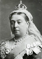
Same as above but with Queen Victoria.
im = ski.io.imread('Queen_Victoria_by_Bassano.jpg').astype('float64')
im = np.sum(im, axis=2)

# reconstruct the data with top p eigenvectors
d,v = np.linalg.eigh(np.cov(im.T))

p = 4 # change this

x = im.copy()
m = x.mean(axis=1)[:,None]
x = x-m

# reconstruct data
y = (x @ v[:,-p:]) @ v[:,-p:].T

# plotting
fig, (ax1, ax2, ax3) = plt.subplots(1, 3)
ax1.imshow(im)
ax2.imshow(y)
ax3.imshow(y+m)
plt.show()
As you can see PCA is pretty good at preserving key features of images even with a few eigenvectors. There are however much better techniques for image compression.
Well done for making it to the end of this practical!
The End.