


Next: Null Data - Pseudo
Up: FMRI data
Previous: Results - noise
Figure 9 shows the activation maps for the different
stimuli from the different datasets. The maps are actually the
mean of the marginal posterior distribution
of  , thresholded to only show
those voxels with probability
, thresholded to only show
those voxels with probability  that
that  .
Unsurprisingly, the most efficient stimulus type, the boxcar,
produces the strongest activation, and the least efficient stimulus
type, the jittered single-event, the weakest activation. Indeed, the
audio stimulus of the jittered single-event dataset produces no voxels
which pass the threshold used. However, due to the strength of the
pain stimulation, there is a good response for that stimulus.
For the boxcar audio-visual stimulus we also performed a standard generalised
least squares (GLS) analysis for comparison. The GLS analysis was performed
using FSL (19).
The preprocessing was the same as for the Bayesian analysis.
FSL (19) performs
voxel-wise time-series statistical analysis using
local autocorrelation estimation used to prewhiten the data (43).
For each of the
stimuli the assumed response
was modelled as a fixed Gamma
HRF (with mean 6 seconds and standard deviation 3 secs)
convolved with the stimulus. A temporal derivative of the assumed response was also included. The resulting z-statistic parametric maps were then thresholded at
.
Unsurprisingly, the most efficient stimulus type, the boxcar,
produces the strongest activation, and the least efficient stimulus
type, the jittered single-event, the weakest activation. Indeed, the
audio stimulus of the jittered single-event dataset produces no voxels
which pass the threshold used. However, due to the strength of the
pain stimulation, there is a good response for that stimulus.
For the boxcar audio-visual stimulus we also performed a standard generalised
least squares (GLS) analysis for comparison. The GLS analysis was performed
using FSL (19).
The preprocessing was the same as for the Bayesian analysis.
FSL (19) performs
voxel-wise time-series statistical analysis using
local autocorrelation estimation used to prewhiten the data (43).
For each of the
stimuli the assumed response
was modelled as a fixed Gamma
HRF (with mean 6 seconds and standard deviation 3 secs)
convolved with the stimulus. A temporal derivative of the assumed response was also included. The resulting z-statistic parametric maps were then thresholded at  to compare with the threshold of
  for the Bayesian analysis.
Figure:
Autoregressive parameters from the [left] boxcar
audio-visual dataset. [middle] jittered single-event pain-audio
dataset. [right] randomised single-event visual-visual dataset.
[top]Four EPI slices.[middle]The first order temporal
autoregressive coefficient
 obtained, where
is the mean of the marginal posterior of
obtained, where
is the mean of the marginal posterior of
 .[bottom]The average spatial autoregressive
coefficient
.[bottom]The average spatial autoregressive
coefficient
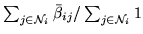 , where
 is the mean of the
marginal posterior of
is the mean of the
marginal posterior of
 .
.
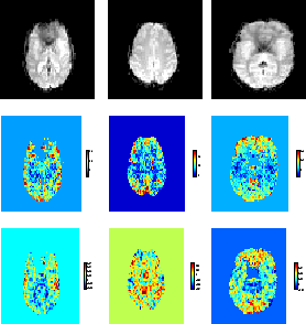 |
Figure:
Maps of  (the
mean of the posterior of ) for voxels with probability
that .
The z-statistics resulting from a generalised least squares analysis
(thresholded at ) is shown for comparison for the boxcar dataset.
(the
mean of the posterior of ) for voxels with probability
that .
The z-statistics resulting from a generalised least squares analysis
(thresholded at ) is shown for comparison for the boxcar dataset.
 |
As with the Bayesian analysis no multiple correction is carried out, although it is worth noting that with the Bayesian approach we do have the joint multivariate marginal posterior distribution for the spatial map of  to perform inference over, thereby avoiding multiple comparison issues. However, full inference of activation incorporating these issues, alongside spatial modelling of the activation height, is beyond the scope of this paper and will be addressed in future work.
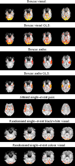
Figure 10 shows the response fits at
strongly activating voxels. The fit corresponds to the marginal
posterior mean of activation height and HRF parameters.
Figure 10 also shows
evenly spread samples from the marginal posterior distribution of
the HRF at the same strongly activating voxels.
The shapes of the HRFs are similar between conditions of
the same design type (e.g. between the visual and audio boxcar),
but quite different between the design types (e.g. between boxcar
and single-event). The boxcar designs have much quicker and more
peaked responses. This is confirmed for all voxels passing the
threshold in the histogram of mean posterior time to peak
(
to perform inference over, thereby avoiding multiple comparison issues. However, full inference of activation incorporating these issues, alongside spatial modelling of the activation height, is beyond the scope of this paper and will be addressed in future work.
Figure 10 shows the response fits at
strongly activating voxels. The fit corresponds to the marginal
posterior mean of activation height and HRF parameters.
Figure 10 also shows
evenly spread samples from the marginal posterior distribution of
the HRF at the same strongly activating voxels.
The shapes of the HRFs are similar between conditions of
the same design type (e.g. between the visual and audio boxcar),
but quite different between the design types (e.g. between boxcar
and single-event). The boxcar designs have much quicker and more
peaked responses. This is confirmed for all voxels passing the
threshold in the histogram of mean posterior time to peak
( ) shown in figure 11.
It is important to appreciate that in the case of the boxcar, the
linearity assumption (of convolving the HRF with the stimulus to
give the response) is incorrect, there will be nonlinearities
present between the underlying neural activity/stimulation and the
BOLD response (17). However, for modelling
simplicity it is usual to proceed with that assumption, but it
should then be not surprising that the HRF looks considerably
different to the single-event HRFs. Furthermore, the boxcar design
has far fewer transitions than the single-event designs and hence
less chances to estimate rise and fall characteristics of the HRF.
Figure 11
shows histograms of mean posterior time to peak ()
for all voxels passing the threshold for the different datasets.
The mode of the
mean posterior time () to peak is about 5 seconds for the
boxcar and randomised single-event designs, and about 8 seconds for the
jittered single-event design.
Figure 12 shows the scatter plots of
the mean of the posterior time to peak () versus the
activation height, , for the voxels which are considered as
activating. For the boxcar visual or boxcar auditory stimuli,
there is an apparent negative correlation between these two
parameters, with large activation corresponding to short delays
and vice versa. For the voxels which are considered as
activating under the single-event stimuli this negative
correlation between these two parameters is less clear, although
there is still a suggestion of some negative correlation between
them particularly for the randomised single-event stimuli. We will
discuss this later in the paper.
There is little evidence of a post-undershoot
in
figure 10, except perhaps for the randomised
ISI stimuli, and there is absolutely no evidence of an initial dip
for any of the stimuli. This is confirmed for all voxels passing
the threshold in the histograms of the initial dip,
) shown in figure 11.
It is important to appreciate that in the case of the boxcar, the
linearity assumption (of convolving the HRF with the stimulus to
give the response) is incorrect, there will be nonlinearities
present between the underlying neural activity/stimulation and the
BOLD response (17). However, for modelling
simplicity it is usual to proceed with that assumption, but it
should then be not surprising that the HRF looks considerably
different to the single-event HRFs. Furthermore, the boxcar design
has far fewer transitions than the single-event designs and hence
less chances to estimate rise and fall characteristics of the HRF.
Figure 11
shows histograms of mean posterior time to peak ()
for all voxels passing the threshold for the different datasets.
The mode of the
mean posterior time () to peak is about 5 seconds for the
boxcar and randomised single-event designs, and about 8 seconds for the
jittered single-event design.
Figure 12 shows the scatter plots of
the mean of the posterior time to peak () versus the
activation height, , for the voxels which are considered as
activating. For the boxcar visual or boxcar auditory stimuli,
there is an apparent negative correlation between these two
parameters, with large activation corresponding to short delays
and vice versa. For the voxels which are considered as
activating under the single-event stimuli this negative
correlation between these two parameters is less clear, although
there is still a suggestion of some negative correlation between
them particularly for the randomised single-event stimuli. We will
discuss this later in the paper.
There is little evidence of a post-undershoot
in
figure 10, except perhaps for the randomised
ISI stimuli, and there is absolutely no evidence of an initial dip
for any of the stimuli. This is confirmed for all voxels passing
the threshold in the histograms of the initial dip,  , and the
post-undershoot,
, and the
post-undershoot,  , for all datasets shown in
figure 13. The ARD prior on the initial dip,
and post-stimulus undershoot will force them to zero if there is
insufficient evidence for them in the data. It is important to
appreciate that this does not necessarily mean that they are not
actually present, just that there is insufficient evidence for
them in the data when using a voxel-wise signal model. Of
the three stimulation types, the randomised ISI design gives us
the most information to estimate the HRF shape. This is because it
provides us with the most transitions between rest and
stimulation. Hence, it is perhaps not surprising that there is
only evidence for the undershoot in this case. The ability of the
randomised ISI to give us better HRF estimation is also
illustrated by the tightness of the samples from the posterior
HRF.
Any of the samples of the HRF posterior in
figure10 can be compared with the samples
from the prior HRF in figure 1(b), to show
that the introduction of the data decreases the uncertainty in the
HRF parameters between the prior and the posterior. This is
Bayesian learning.
, for all datasets shown in
figure 13. The ARD prior on the initial dip,
and post-stimulus undershoot will force them to zero if there is
insufficient evidence for them in the data. It is important to
appreciate that this does not necessarily mean that they are not
actually present, just that there is insufficient evidence for
them in the data when using a voxel-wise signal model. Of
the three stimulation types, the randomised ISI design gives us
the most information to estimate the HRF shape. This is because it
provides us with the most transitions between rest and
stimulation. Hence, it is perhaps not surprising that there is
only evidence for the undershoot in this case. The ability of the
randomised ISI to give us better HRF estimation is also
illustrated by the tightness of the samples from the posterior
HRF.
Any of the samples of the HRF posterior in
figure10 can be compared with the samples
from the prior HRF in figure 1(b), to show
that the introduction of the data decreases the uncertainty in the
HRF parameters between the prior and the posterior. This is
Bayesian learning.
Figure 10:
Posterior HRF for a strongly activating voxel in each of the
datasets. [left]
Mean posterior fit (high-pass filtered data as a broken line, response fit
as a solid line). [right] 11 evenly spread samples from the posterior of the
HRF. The posterior mean HRF is plotted along with different
HRFs each of which have one
parameter varying at the
 percentile of the posterior,
with the other parameters held at the mean posterior
values.
percentile of the posterior,
with the other parameters held at the mean posterior
values.
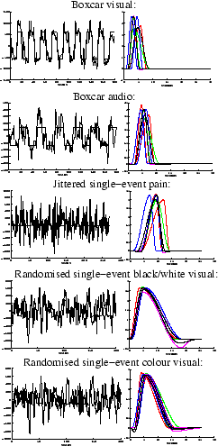 |
Figure 11:
For the voxels which are considered as activating
for each of the datasets:
[left] Histogram of the posterior mean of the time to peak, .
[right] Histogram of the posterior standard deviation of the time to
peak, .
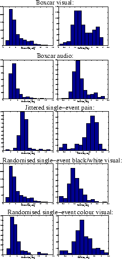 |
Figure 12:
For the voxels which are considered as activating
for each of the datasets:
[left] Scatter plot of the posterior mean of the
time to peak, , versus the posterior mean activation
height, [right] Spatial map of the time to peak, .
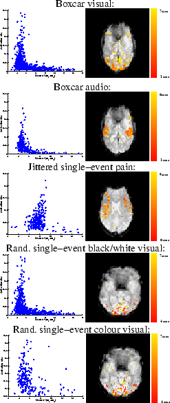 |
Figure 13:
(a) Histogram of the posterior mean of the HRF
characteristic (a) (initial dip), and (b)
(post-stimulus undershoot) for the voxels which are considered as
activating from all datasets.
 |
Next: Null Data - Pseudo
Up: FMRI data
Previous: Results - noise